
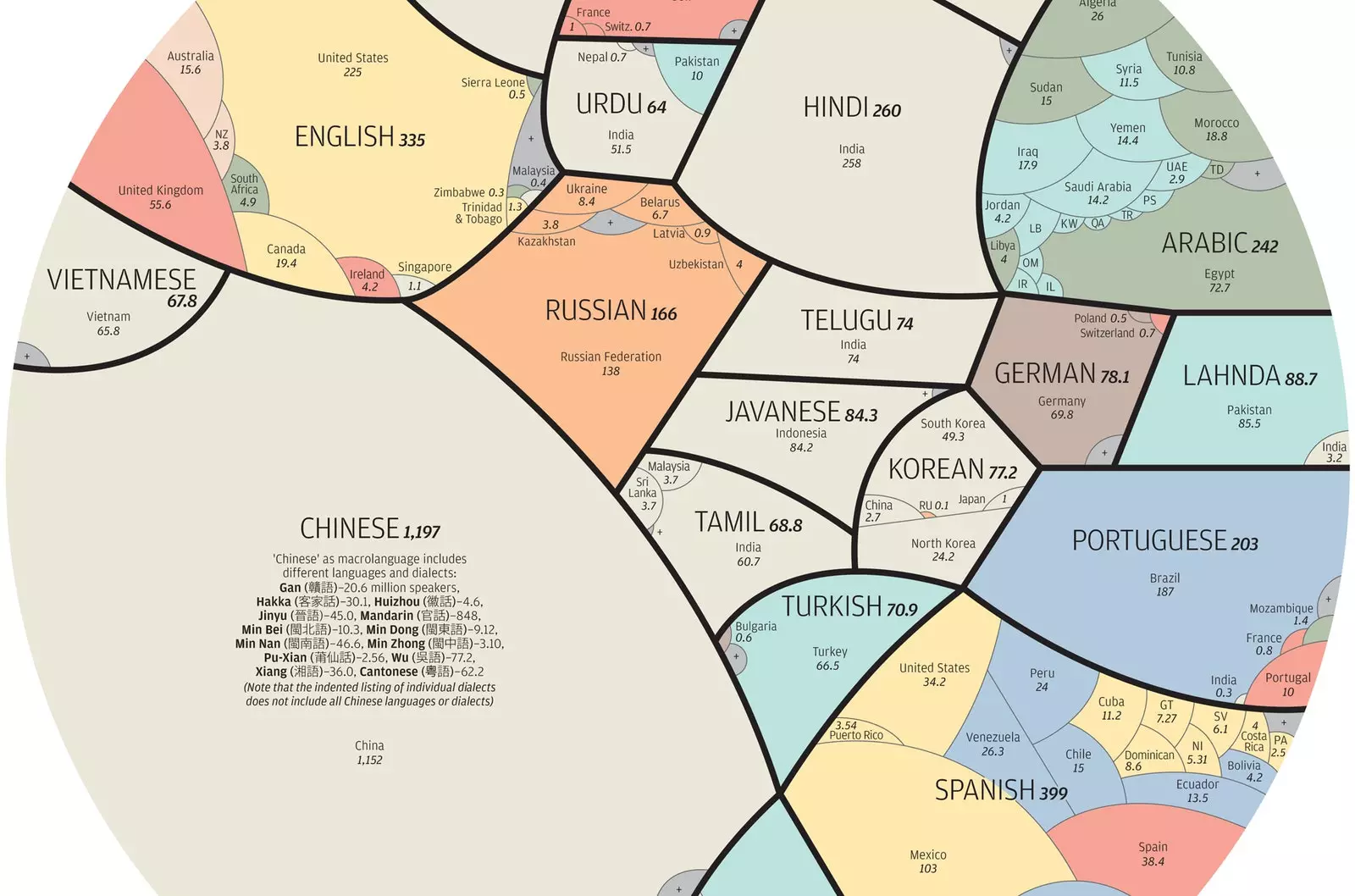
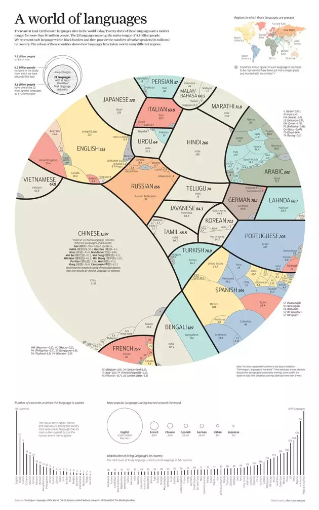
'A World of Languages', the infographic by Alberto Lucas López for the South China Morning Post
Specifically, at least 50 million people use each of them as their mother tongue and, between all of them, they reach 4,000 million people. What if we gave these data color and shape to visualize them? The result looks like this.
A world of languages is the name of the infographic created by **Alberto Lucas López, Graphic Director at the South China Morning Post**.
In the graphic, each language can be delimited by black dividing lines within which is indicated the number (in millions) of people who use that language as their mother tongue in each country . In addition, each country receives the color of the region in which it is located, which allows us to appreciate how each language has penetrated the different parts of the world.
To carry out this infographic, it has been used as a sample base 6.3 billion people . In addition to the visual representation, other data such as the total number of countries in which each language is spoken (31 in the case of Spanish) or what are the most studied languages in the world : English (1.5 billion students), French (82), Chinese (30) and Spanish (14.5) .
Lovers of languages, here you have hours of entertainment